Title
Linc
Expertise
UX Research, Competitive Analysis, Branding, Mobile App
Year
2023
UX/UI design/strategy for an AI-driven social media dating app focused on empowering user communication and charisma. [Senior Thesis]

Overview & Challenge
For my senior thesis project, I chose to address a fundamental challenge in the digital age: bridging the gap between digital connection and meaningful in-person human interaction. Linc was a social dating application designed to tackle this issue. In an era of digital oversaturation, the challenge was to create a platform that not only connected users online but also motivated them to build confidence and have genuine conversations in the real world.
How can we utilize technology as a tool to build self confidence and encourage non-digital relationships?
Our Approach: A Strategic UX Framework
To solve this human-centered problem, I adopted a comprehensive UX framework that focused on understanding the user, the market, and the brand. My approach involved three key phases:
Market Research & Competitive Analysis: I began by researching the current online dating landscape to identify key trends, best practices, and gaps in the market.
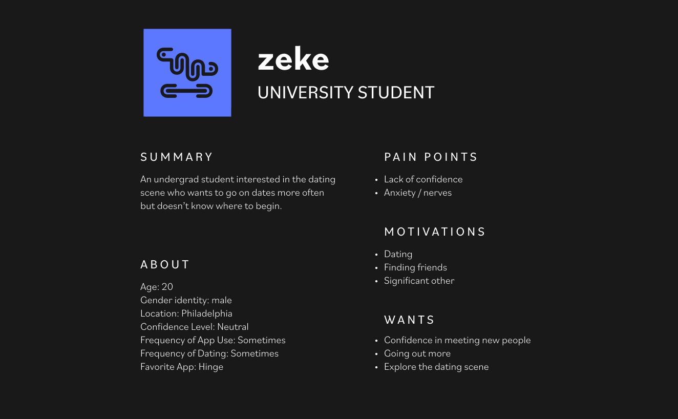
Persona & User Journey Development: I defined key user personas and mapped out their journeys to understand their pain points and motivations for seeking real-world connections.
Strategic Design & Visual Identity: Using the insights from my research, I moved into the design phase, focusing on a strategic user flow and a cohesive brand identity that would resonate with my target audience.

Phase 1: Research & Discovery
I began with a literature review and a deep dive into the online dating market, analyzing the strengths and weaknesses of popular competitors like Tinder, Hinge, and Bumble. This analysis revealed a key opportunity: while many apps focused on the swipe-and-match model, there was a clear user desire for features that led to more authentic, in-person experiences. My research validated the need for a solution that moved beyond the screen.
Phase 2: Ideation & Design
Based on my research, I developed a strategic user flow and journey map that guided users from a simple profile setup to a successful real-world interaction. Using Crazy 8s and iterative wireframing, I explored numerous design solutions for key features. This rapid ideation process helped me refine the app’s navigation and functionality, ensuring a seamless user experience that was both intuitive and engaging.
Phase 3: Visual Identity & Final Designs
The brand identity was designed to be social, playful, and innovative. I developed a visual system that included a vibrant color palette, a friendly typeface, and a suite of icons to reflect this core brand trait. The final designs provided a clean and intuitive user interface with clear navigation, an inviting homepage, and a strong visual aesthetic that differentiated Linc from its competitors.


Key Outcomes & Impact
This project successfully resulted in a cohesive and user-centered application that provided a clear path for users to find authentic, real-world connections. By leveraging a strategic UX process, the final designs addressed the key user pain points identified in my research, culminating in a successful and comprehensive thesis project that demonstrated my end-to-end design capabilities.


Homepage
Consider our homepage a hybrid of Twitter, Instagram, and Headspace. Users can view their following’s posts, suggested trainings, and upcoming events.

Direct Messaging
When starting a chat with someone new, a callout prompts the user to kickstart the convo by trying our special features

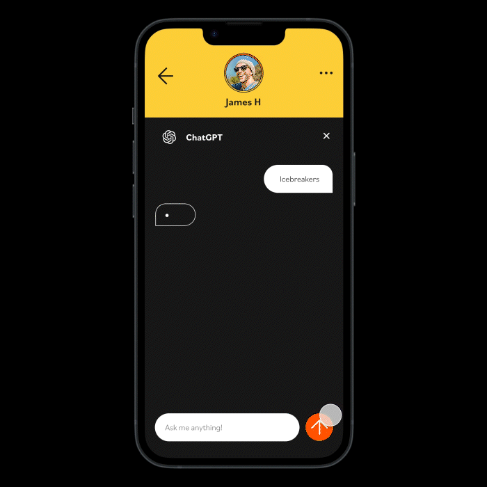
ChatGPT
Our built in AI helps encourages users to communicate confidently with their matches
Profile
Your profile has two primary interfaces: posts & trainings. Users are provided with suggested trainings based on AI conversation analysis from previous dates.

Profiles
When viewing profiles, we can see posts to get a feel for who they truly are. Trainings remain invisible for privacy concerns.


Creative Direction: Soonduk Krebs & Abby Guido
Design: Lexi Birzes
Duration: 15 weeks
Institution: Tyler School of Art & Architecture